Creating skewed elements using a neat CSS border trick
2022-02-12
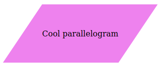
Rectangles are boring. Everyone knows how to make rectangles. The entire web mostly uses rectangles. Let’s make a cool parallelogram like the one you see in the top menu of this website.
Don’t care about how and why? Just check out the full code here (you can save the page using Ctrl + S).
1. Create a rectangle
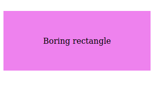
First let’s start off by creating a boring flexbox rectangle.
<style>
    .main {
        display: flex;
    }

    .element {
        display: flex;
        align-items: center;
        background-color: violet;
        height: 120px;
        padding: 0 80px;
    }
</style>

<div class="main">
    <p class="element">
        Boring rectangle
    </p>
</div>
Your page now looks something like this:
2. Add pseudo-elements
First we will add the ::before and ::after psuedo-elements to our rectangle. We will eventually use these to trim off the edges and turn our rectangle in a much cooler parallelogram.
.element::before {
    content: '';
    display: block;
    height: 0;
    width: 0;
}

.element::after {
    content: '';
    display: block;
    height: 0;
    width: 0;
}
You will see no changes yet. If you open your page using the inspector you will see that the pseudo-elements have been created, but they are obviously still empty.
3. Add borders to the pseudo-elements and remove the padding.
In this case replace white with the color of the element behind your parallelogram.
.element::before {
    border-right: 80px solid transparent;
    border-top: 120px solid white;
    content: '';
    display: block;
    height: 0;
    width: 0;
}

.element::after {
    border-right: 80px solid white;
    border-top: 120px solid transparent;
    content: '';
    display: block;
    height: 0;
    width: 0;
}
If you look at your page now you’ll see it starting to turn into a parallelogram.
All we now have to do is remove the padding: 0 80px; from our initial element.
.element {
    display: flex;
    align-items: center;
    background-color: violet;
    height: 120px;
}
And there you have it:
But how does it work?
What we’re doing here is (ab)using the corner where two borders intersect. The right and top border are different colors so the browser will draw a diagonal separation at this intersection.
The pseudo-elements themselves are practically invisible because they are 0*0 px in size, so all we see from this element is the intersection at the corner. We use this as the diagonal edges of our parellelogram.
We made the “visible” part of the corner transparent so you know that the corner will always be the same color as your element. It means you can also use image backgrounds or gradients with this trick.
Addition:
You can probably also achieve the same thing using transform: skew(), but I think it’s easier to run into issues having to calculate using degrees instead of pixels on a X and Y axis like I do in this method.